Jewish General Hospital's Critical Care Pavilion
Located in the heart of the cosmopolitan Côte-des-Neiges district in Montreal, this ambitious expansion project for the Jewish General Hospital brings together in a single building the hospital’s critical, intensive, and emergency care operations. With a total area of 85,000 m², the new pavilion constitutes an expansion of close to 40% of the existing area of the hospital. In Quebec, this represents the first major modernization of a university hospital campus achieved by centralizing the components and advanced technologies of a contemporary hospital in a single new construction. From its inception in 2009 to its inauguration in 2016, the project mobilized a total of more than 120 architects and engineers from programming to construction, including nearly 50 people within our firm.
Location
Partners
Gross Kaplin Coviensky
Marosi Troy
Scale
85 000 m² / 315 M$
Completion
2009 — 2016
Download the book dedicated to the project, which highlights the fruits of excellence in health architecture. The book, which was designed in-house, includes a summary description of the design principles, the various themes developed, as well as the many issues that were resolved throughout the project. It is accompanied by illustrations and photographs by architectural photographer Stéphane Groleau. It took the photographer two years and six sessions to complete the mandate, given the great complexity of the building's operations.
See also the article “State-of-the-art facilities at the Jewish General Hospital's Critical Care Pavilion to address COVID-19” in the Journal
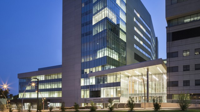
With the hospital’s critical care functions now located in one building, the operation of the hospital campus is optimal. The facilities built between 1934 and 2009 retain less technically demanding functions, enriched as such in a sustainable manner. The new pavilion welcomes patients in an ultramodern space bathed in natural light, designed to maximize the effectiveness of treatments, services, and circulation, and to help control the spread of infection while maintaining the privacy, dignity, and safety of patients.
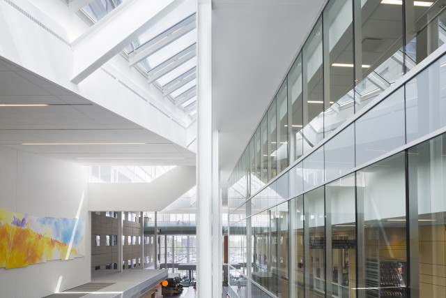
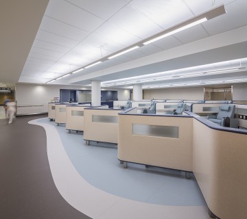
The program includes an innovative emergency department inspired by the best practices in North America and the largest in the province; a surgery unit with 18 operating rooms; a day hospital; two floors of intensive and coronary care with privileged access to natural light; a 700 m² cardiac catheterization suite; the departments of obstetrics and neonatology; six floors of care units totalizing 152 single rooms, including one floor for 24 isolation beds; a new sterilization sector; a centralized supply sector for the entire institution; common areas (Agora, lobby, hall, food court, public washrooms); outpatient, clinical, therapeutic, and diagnostic services; customer service, archiving, logistics, and support services (workshops, receiving docks, shipping, procurement); as well as food, administrative, and IT services.
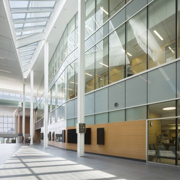
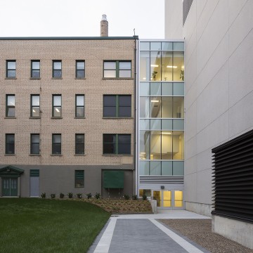
Public Spaces
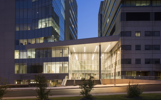
A substantial contribution to the project was to design an open reception area which brings together the new construction and the existing buildings. The new entrance provides a clear and efficient path to both the new pavilion and the older buildings. Additionally, the innovative Hospital Street concept, endorsed by institution officials, created several new indoor public access points to treatment areas in other pavilions.
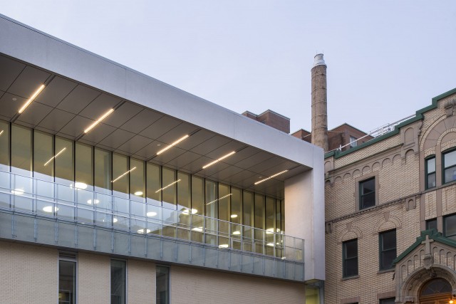
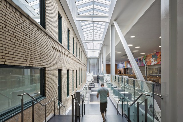
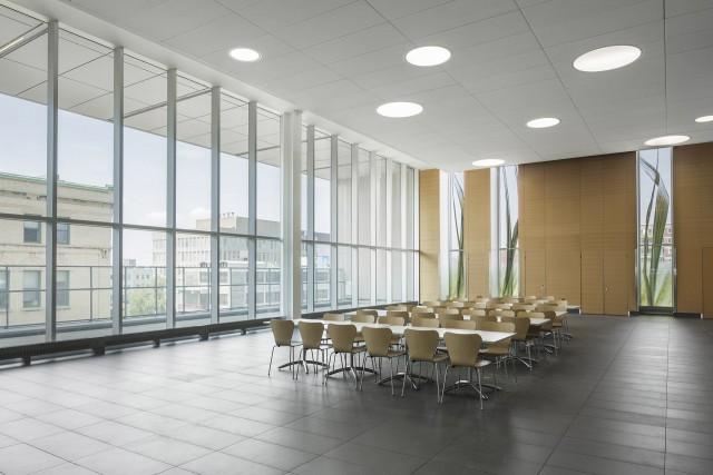
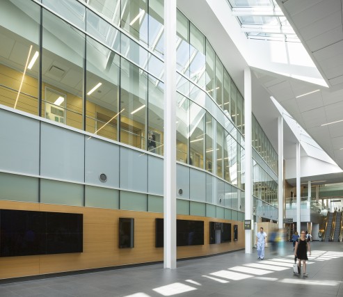
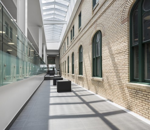
The central atrium, called the Agora, was designed to promote interactions between staff and patients. This new indoor street was thought out to improve the orientation and wayfinding of visitors and users, offering them a quick understanding of different circulation routes, and, consequently, of the institution's functions. It is bordered with shops and rest areas, including a café, two indoor patios, three food stands, three shops, a dining area, and an outdoor patio. In a dialogue with the existing structure, the Agora helps to highlight the heritage building of the former convent of the Sœurs de Sainte-Croix, acquired by the establishment in 2005.
Critical Care
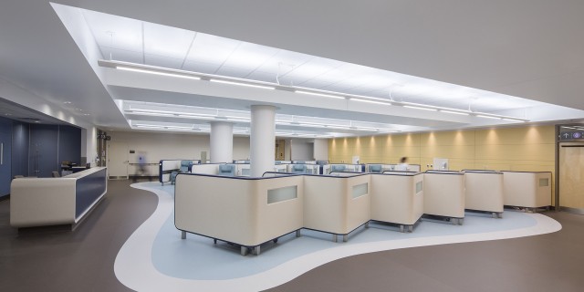
The project includes the development of the largest emergency unit in Quebec, covering 6,600 m². The department offers double access (public/private) to each stretcher under observation as well as a Rapid Assessment Zone (RAZ) – a space with comfortable armchairs close to the treatment staff – two main elements that help reducing wait times and bottlenecks. By separating patients into two groups from the moment they are admitted – inpatients unable to walk and outpatients who are treated in the Rapid Assessment Zone – the service aims to increase users flow by treating more patients in less time. Patients and medical staff have access to spaces dedicated to them, promoting greater staff efficiency and the improved well-being of the care recipients.
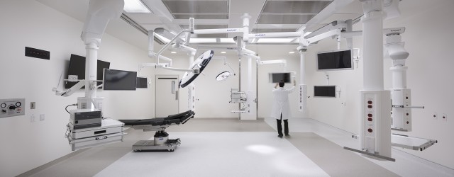
Intensive care units include: medicine and surgery (36 beds); coronary care (18 beds); integrated cardiovascular care (36 beds); a neonatal intensive care unit with 40 cribs; a birthing centre with 15 rooms and 12 antepartum beds for high-risk pregnancies; four care units with 32 single beds in medicine and surgery; an isolation ward with 24 beds; a day hospital; a surgery unit with 18 operating rooms; respiratory therapy care; a part of the medical imaging department; a cardiac catheterization suite; a blood bank; and procurement. The units are served by clusters of highly efficient elevators, one for patient transfers between the emergency department, operating rooms and intensive care units, and the other for routing sterilized items from the sterilization room to the operating room.
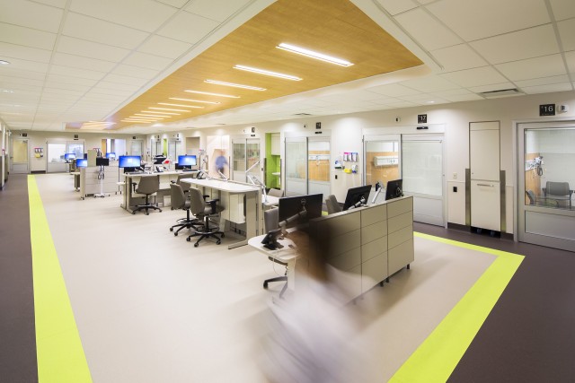
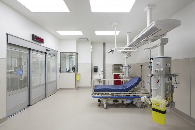
“Building a new intensive care unit was a wonderful opportunity. The spaces dedicated to patients in the former intensive care unit were inadequate and suffered from noise pollution and a major lack of natural light. We finally had the possibility of getting private rooms for all our patients. Our concerns were thus focused on our ability to carry out adequate monitoring, to recognize a change in patients’ conditions, and to respond promptly. The designers of the intensive care unit were able to consider all these issues. We regularly receive positive feedback from patients and their families about the amount of natural light, the quality of spaces, and the noise control. The healthcare team quickly adapted to the changes brought about by the implementation of the new design with private rooms. The pride that we have always had in our team is now doubled with the pride of working in such a beautiful, functional, and patient-centred environment.”
Chief, Intensive Care Unit
Natural Light
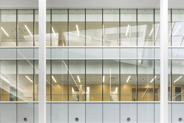
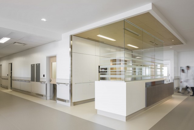
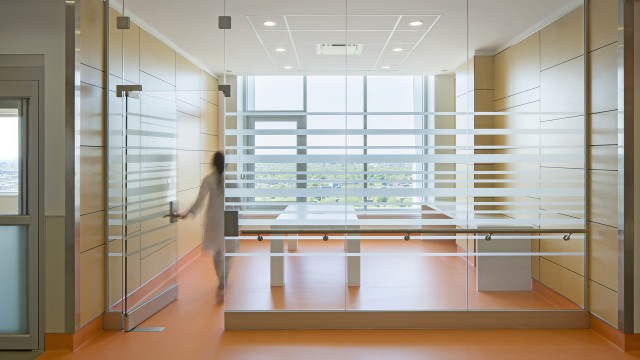
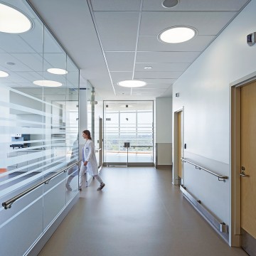
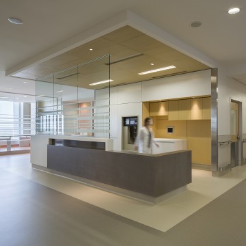
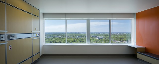
The abundance of natural light and exterior views are omnipresent in the building, both in the treatment areas and in spaces reserved for employees and the public. The tower was extended to allow for the addition of open and transparent spaces aligned with the nursing stations, and to let natural light reach the heart of the building to benefit the medical staff. Contact with the outdoors has been proven to help reduce stress and fatigue while promoting well-being and improving retention of healthcare personnel.
The project is primarily designed to ensure the well-being of patients and staff. The goal was to develop therapeutic, quiet environments that promote healing, and to design care units for the improved comfort and quality of life of patients and staff. It has been proven that the effects of natural light and views of nature have an important influence on a patient’s treatment and recovery time.
Interior courtyards were built in the basilar to provide natural light in the heart of the structural volume on every intensive care unit floor. The work Les Jardins by artist Pierre Fournier is installed there. The provision of natural light is enhanced by the presence of works of art, which facilitate interior orientation by acting as points of reference.
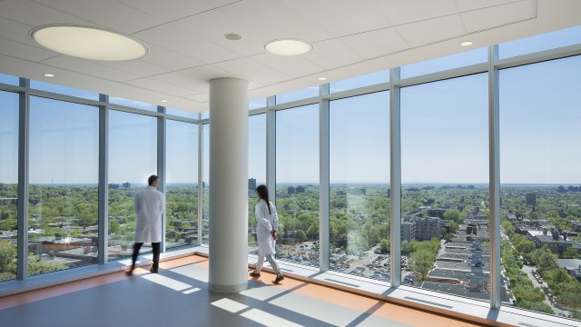
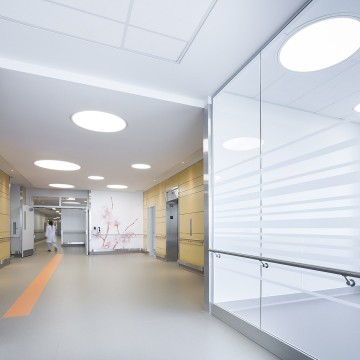
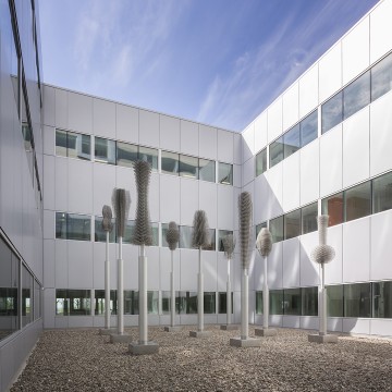
“Natural light not only contributes to the well-being of patients, but also to that of the staff. Some people stated that they were happier coming to work and felt less tired at the end of the day. And patients call less often. Could this be due to the new proximity of the staff, individual rooms, or reduced noise? Or maybe it’s a combination of all these factors? In addition, in the neonatal intensive care unit, there is a marked decrease in physiological monitoring alarms since the move. The new environment is really having a positive effect on all our patients.”
Director of the Transition Office and Associate
Director of Innovation, and Quantitative and Prescriptive Analysis
West-Central Montreal Health
Orientation and Signage
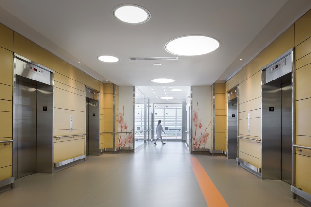
The first contact with a hospital as a patient or visitor is often a source of confusion and stress, due in part to the inherent intricacies of large hospital complexes. Often built during successive periods, the various pavilions of a hospital campus have characteristics of their own, dictated by the need for easy road access, technical function, and specialized equipment. To remedy this problematic perception, it was important to allow visitors to have a clear understanding of the organization of the new and existing pavilions. The atrium, which is three storeys high and whose abundance of natural light comes from the skylight spanning over 150 metres, creates a new point of entry to the hospital and embraces much of the entire campus. To provide simple and instinctive orientation, public elevators are visible upon entry to the building, thereby minimizing the efforts of staff and volunteers to guide newcomers.
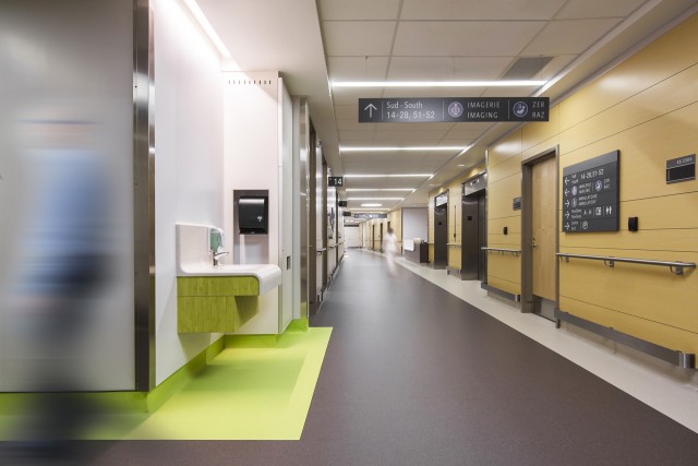
Several other elements promoting effective orientation and wayfinding for patients, visitors and medical staff were integrated into the conceptual development of the project, including: efficiency; the segregation and hierarchization of areas and circulation networks for the public, patients, medical staff and equipment; the creation of separate zones for different activities relating to reception, waiting, preparation, response, and recovery to facilitate the treatment process; enhancement of patient reception at the entrance of each service by clear access signage in a quiet, safe and serene therapeutic environment; plenty of outside views allowing for greater ease of orientation for users and well-being of medical and non-medical staff; and the use of colour to differentiate floors and departments.
Logistics
The expansion constitutes a 40% addition to the existing hospital area, which grew from 150,000 m² to 235,000 m². Consequently, a complete review of logistics systems was necessary to reflect circulation flows between the new and the old areas for staff, stretcher patients, medical supplies, pharmacy and food trolleys, as well as common and biomedical waste. The grouping of activities was carried out following the testing of numerous configurations depending on their functional affinities and by optimizing the links of proximity and fluidity among certain functions, treatment posts, and areas of recovery.
The fluidity of vertical circulation is a key element of the functional concept. Four elevator hubs were established: for the public; for logistics and movement of patients; for patient transfers between the emergency department, operating rooms and intensive care units; and for the routing of sterilized equipment in the surgical unit. These were strategically positioned to allow isolation of uses, ease of access, and rapid movement between floors.
Sterilization /
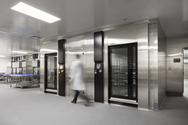
A new Sterilization Department was designed to meet all the needs of the Hospital as formulated by those in charge of this key department and according to the latest standards. A simple layout was developed to achieve a linear and controlled process. The interior finishes were the subject of particular attention to meet the required aseptic levels and to provide a safe and pleasant working environment.
Large-volume pneumatic chute system /
The project includes the integration of the first automated system for collecting waste and soiled linens inside a hospital building in Canada. By replacing the traditional chute process that generated significant movement of contaminated materials throughout the interior of a hospital, this automated system diverts contaminated elements of each floor directly to the laundry and garbage containers, located outside the building. This system provides the dual benefit of reducing nosocomial infections and of saving on maintenance staff.
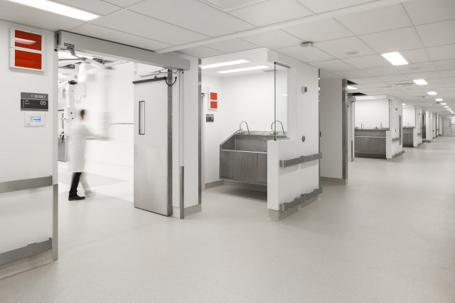
In addition to the abundance of natural light, the use of LED lighting and triple Low E glass, superior roof and wall insulation, and energy efficiency strategies including recovery of energy through mechanical systems; the choice of durable and sustainable interior finish materials and construction details such as protective corners, handrails and wall bars against stainless steel trolley hits; intensive-use furniture in Corian―, is also a decisive element in the durability and quality of the building.
